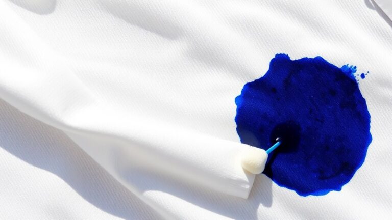
Stunning Calligraphy Projects With Top 7 Ink Colors
Many calligraphy enthusiasts struggle to find the perfect ink colors to make their projects truly stand out. You’re not alone—creating eye-catching, elegant pieces can feel overwhelming with so many options out there.
To create stunning calligraphy projects, choose from top ink colors like rich Sumi black, shimmering gold or silver, vibrant emerald or ruby, lively turquoise or fuchsia, creamy white, and deep iron gall. These colors help evoke emotion, add elegance, and create bold contrast on different surfaces.
Mixing and matching these hues boosts your work’s depth and impact. Keep exploring these options, and you’ll uncover even more ways to elevate your calligraphy masterpieces.
Key Takeaways
- Select vibrant ink colors like sumi, emerald, and fuchsia to create eye-catching and varied calligraphy projects.
- Use metallic inks such as gold and silver for luxurious accents on special occasion pieces.
- Combine complementary colors for dynamic contrast and depth in your calligraphy artwork.
- Experiment with different ink types like watercolor or walnut for textured, artistic effects.
- Match ink colors to surface materials. For example, white inks on black backgrounds create a striking contrast, while waterproof inks add durability.
Why Choosing the Right Ink Colors Matters in Calligraphy
Choosing the right ink colors is essential because it directly influences the mood and overall visual impact of your calligraphy. Your selection of ink colors can emphasize specific elements and evoke emotions, shaping the viewer’s experience.
High-quality inks, like sumi or metallic, deliver vibrant, consistent colors that enhance your work’s aesthetic. Moreover, color contrast between ink and paper plays a vital role in readability; darker inks such as iron gall provide sharpness, while lighter shades offer subtle elegance.
It’s also important to consider drying times and flow properties to achieve smooth, even strokes and prevent smudging. By thoughtfully choosing ink colors, you create visual harmony and depth, making your calligraphy projects more compelling and visually striking.
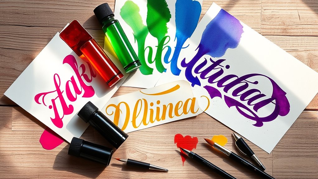
Top 7 Calligraphy Ink Colors for Vibrant, Elegant Letters
For creating vibrant and elegant calligraphy, certain ink colors really stand out as essential choices to add depth and sophistication. Rich blacks like sumi ink give a bold, matte finish that’s perfect for striking modern styles.
Metallic inks such as gold and silver bring a luxurious shimmer, making them ideal for formal invitations or decorative accents. Vibrant jewel tones like emerald and ruby offer rich, vivid colors that feel luxurious and classic.
Bright shades like turquoise and fuchsia inject energy and playfulness into your work. The table below highlights some top ink colors and how they can enhance your calligraphy:
| Ink Color | Best Use | Style Type |
|---|---|---|
| Sumi Ink | Bold, matte black | Modern calligraphy |
| Gold/Silver | Elegant, shimmering accents | Formal, decorative |
| Emerald/Ruby | Rich, vibrant tones | Classic, luxurious |
| Turquoise/Fuchsia | Bright, lively colors | Playful, modern |
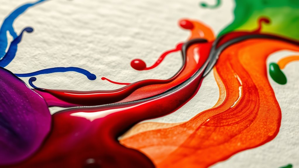
How to Mix and Match Colors to Enhance Your Calligraphy
Experimenting with complementary colors like blue and orange or purple and yellow can really make your calligraphy pop with vibrant contrast.
Mixing shades within a monochromatic scheme adds depth, making your work more interesting. Combining metallic and matte inks also creates cool textures.
Always test your color combinations on scrap paper first. This way, you can make sure they blend well before you start on your final piece.
Complementary Color Pairings
Complementary color pairings are a fantastic way to make your calligraphy really pop with striking contrast. They help highlight specific words or elements, guiding the viewer’s eye naturally.
When choosing ink colors, think about the pros and cons of bold versus subtle contrasts. Bold pairs catch attention but can overwhelm your design if overdone.
Using high-quality paper is key. It ensures smooth ink flow and prevents bleeding, which keeps your colors vibrant and crisp.
Keep your privacy policy in mind when sharing your work online. Bold colors reveal more detail, so be mindful of what you’re displaying.
Experimenting with different shades and opacity levels adds depth and energy to your work. From soft harmonies to bold statements, it’s all about creating the right mood.
With thoughtful pairing, you can take your calligraphy to a whole new level of visual impact.
Creating Harmonious Blends
Building on your knowledge of color pairings, creating harmonious blends allows you to add depth and subtlety to your calligraphy. Start by mixing complementary colors, like blue and orange, to produce vibrant gradients that bring energy to your work. Using a limited palette of harmonizing inks, such as pastel pinks and purples, helps achieve a cohesive, soothing effect.
Experiment with blending metallic and matte inks to create striking contrasts that emphasize specific strokes or embellishments. Always test your color combinations on scrap paper first to ensure the blends *improve* rather than distract from your piece. Gradually layering different shades will give you smooth *progressions* and nuanced color blends.
This approach elevates your calligraphy’s overall aesthetic and makes your projects more dynamic and visually appealing.
Applying Ink Colors on Different Surfaces: Tips and Tricks
Applying ink colors on different surfaces requires careful consideration of the material’s properties to get vibrant, long-lasting results. Keep these tips in mind to do it effectively:
Applying ink on various surfaces demands attention to material properties for vibrant, durable results.
- Choose the right ink: Use waterproof inks for ceramics and fabric inks for textiles to ensure durability and prevent fading.
- Control moisture: Porous surfaces like paper can cause bleeding, so regulate moisture and pick the right nibs for sharp lines.
- Enhance contrast: Metallic inks work well on dark backgrounds, while whites pop on black surfaces for a striking effect.
Always test your ink on a small, hidden area first to avoid surprises. Layering and blending with water or washes can add depth, but proper surface prep is essential for consistent, professional results.
Using Ink Colors in Modern and Traditional Calligraphy Styles
Whether you’re aiming for a sleek, contemporary look or a timeless, elegant piece, the choice of ink colors is key to defining your calligraphy style. Modern calligraphy often features bold, vibrant inks like metallics and sumi to create striking contrast and contemporary effects.
Traditional styles tend to favor classic shades such as rich blacks, sepias, and earthy tones, which emphasize elegance and timelessness. Incorpor’s a lot of room to experiment with different inks, like walnut or bister, to add depth and dimension through blending or layering.
The ink color also sets the mood—brighter hues can evoke playfulness, while darker shades convey a sense of formality. Trying out specialized inks like iron gall or watercolor-based options can help you explore transparency, texture, and color blending, enriching both modern and traditional calligraphy projects.
Solving Common Ink Color Problems in Calligraphy
When you notice color inconsistencies in your calligraphy, start by figuring out the cause—things like incompatible paper or incorrect ink mixing. To troubleshoot, keep these tips in mind:
- Use good-quality inks like sumi or iron gall to avoid bleeding and keep your colors consistent.
- Be careful when mixing custom colors with powders; if you don’t dilute properly, it can look muddy or uneven.
- Make sure your inks have the right binders or fixatives to prevent smudging or fading over time.
Testing your inks on different papers can help you see what works best, and adjusting the dilution can make your colors pop more. Choosing inks made specifically for calligraphy will give you truer colors and a smoother writing experience.
Inspiring Projects Using These Top Ink Colors to Spark Your Creativity
Have you ever wondered how different ink colors can transform your calligraphy projects? Vibrant inks like metallic and watercolor add depth and visual interest, making your work stand out.
Vibrant inks like metallic and watercolor add depth and visual interest, making your work stand out. Walnut ink combined with watercolors creates spontaneous effects perfect for artistic lettering. Bold inks such as iron gall and sumi amplify contrast and legibility in intricate designs.
Experimenting with color schemes like complementary or analogous hues can help you discover fresh ideas for wedding invitations or mail art. High-quality inks that flow smoothly and resist smudging are key to a professional finish.
To help you explore, here’s a quick guide:
| Ink Type | Ideal Use | Notable Effect |
|---|---|---|
| Metallic | Elegant titles, accents | Shimmering, eye-catching |
| Watercolor | Artistic backgrounds, subtle shading | Soft, blended hues |
| Walnut | Spontaneous effects, textured lettering | Unique, organic patterns |
| Iron Gall | Fine details, contrast enhancement | Sharp, dark lines |
| Sumi | Bold strokes, traditional style | Deep black, expressive strokes |
Frequently Asked Questions
Which Calligraphy Is the Most Beautiful?
You’ll find that the most beautiful calligraphy combines elegant styles like Copperplate or Spencerian with high-quality inks such as sumi or metallics. Your choice of vibrant or pastel colors can add a luxurious or delicate touch.
Focus on smooth, consistent strokes and balanced spacing to improve the overall beauty. When you pay attention to contrast and embellishments, your calligraphy will truly stand out as stunning and enthralling.
Which Colors Are Best for Calligraphy?
Colors in calligraphy are your palette of emotions, and choosing the right ones makes your art sing. Deep black inks like Sumi or Iron Gall give your work powerful permanence. Metallics like gold add a luxurious sparkle, while vibrant shades like crimson or emerald create bold contrast.
Earthy tones like walnut lend vintage charm, and water-based inks offer soft, gradient effects. Pick colors that match your mood and project’s theme for maximum impact.
What Is the Art of Using Ink to Create Beautiful Handwriting?
The art of using ink to create beautiful handwriting involves skillfully selecting and applying different ink types like sumi, iron gall, or metallic inks.
You focus on controlling flow, opacity, and drying time to achieve the effects you want. By blending, shading, and experimenting with ink and paper interactions, you add depth and personality to your work.
Balancing color, contrast, and line weight makes your calligraphy expressive and visually stunning.
What Is the Best Calligraphy Ink for Smooth Writing?
You want smooth writing, so choose sumi ink or high-quality fountain pen inks. Imagine a silky stream flowing effortlessly across your paper, creating bold, consistent lines without skips.
Sumi ink’s rich black hue glides smoothly on rice paper, giving your calligraphy a beautiful, seamless look. Pigmented fountain pen inks also offer vibrant, fluid strokes with minimal feathering.
Both types of ink provide the flow you need for elegant calligraphy, making your writing feel effortless and beautifully crafted.
Conclusion
Choosing the right ink colors transforms your calligraphy from simple strokes to mesmerizing art. While vibrant hues catch the eye, subtle shades add elegance.
Balancing bold and delicate tones is like blending tradition with innovation. Each stroke tells a story. So, experiment boldly and thoughtfully.
In calligraphy, just like in life, the right color choice can turn a blank page into a masterpiece waiting to unfold.